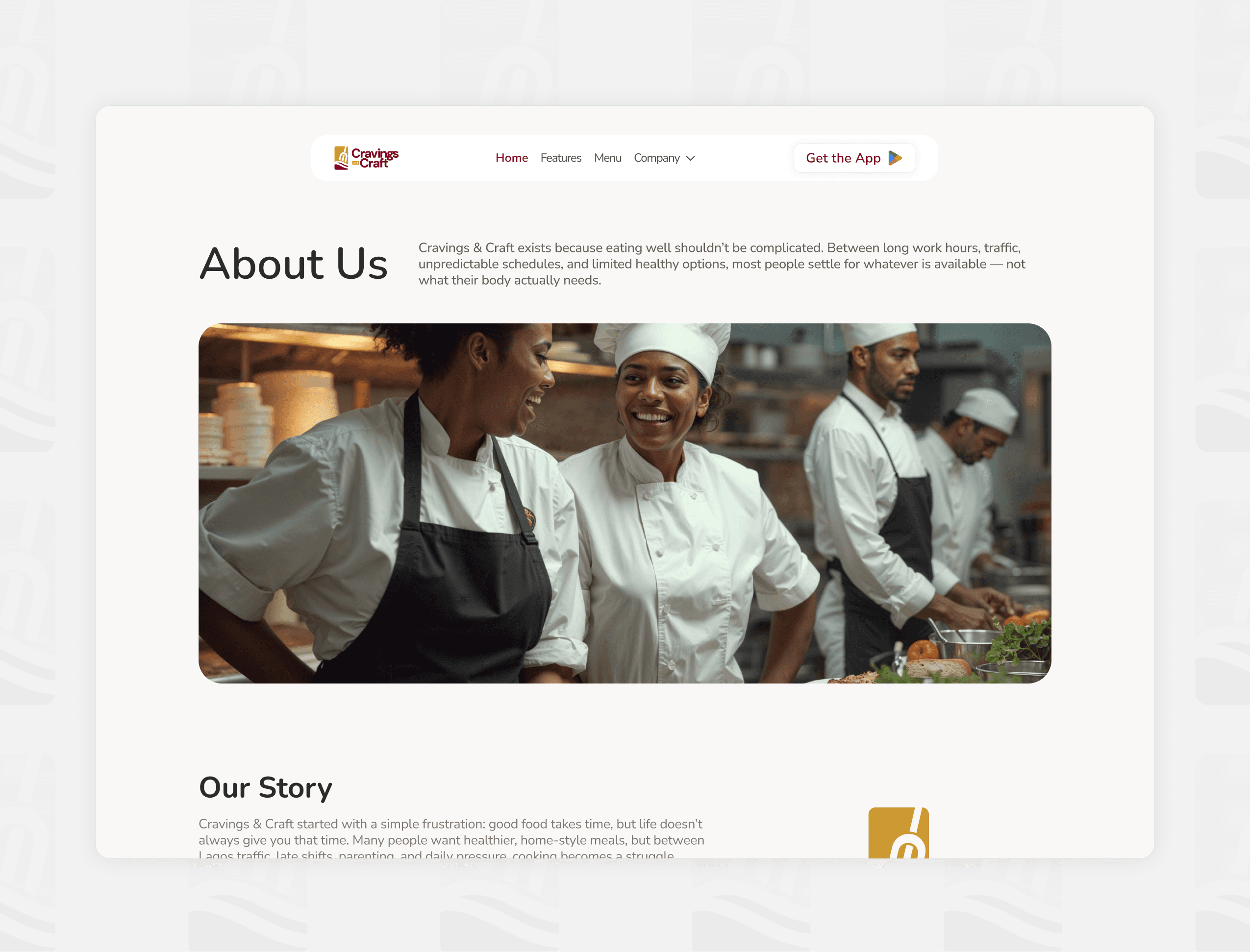
Cravings and Craft
Cravings and Craft is a personalized food ordering platform designed to move beyond traditional delivery apps by tailoring meals to individual preferences, dietary needs, and lifestyle goals.
The platform includes: A customer-facing mobile, an admin dashboard, transactional email systems and a marketing website to position and onboard users
Client
Cravings and Craft
Service Provided
Web Design, Web Development, Mobile App, Framer Development

The Problem
Most food delivery platforms are transactional and overwhelming:
Users scroll through long menus without guidance
There is little support for dietary needs or allergies
Decision fatigue leads to poor choices or abandoned sessions
Platforms are optimized for choice, not clarity
At the same time, there is a growing need for:
Personalized nutrition
Convenient daily meal planning
Reliable ordering for families, schools, and organizations
The opportunity was to design a system that reduces friction by making food selection intent-driven rather than option-driven.
Business Goals
The product was designed to support both short-term MVP validation and long-term scalability.
Primary Goals
Validate demand for personalized food ordering
Enable fast onboarding and first-order conversion
Support repeat usage through personalization and subscriptions
Establish a foundation for B2B partnerships (schools, gyms, corporate)
Secondary Goals
Build a system that can scale across:
Individual users
Families (beneficiaries)
Institutional clients
Create a consistent brand experience across all touchpoints
My Role & Scope
I was the sole Product Designer, responsible for:
Product Design
Customer app (mobile)
Admin dashboard (web)
Experience Systems
Transactional email templates
Notifications and feedback states
Marketing & Growth
Marketing website (designed and developed by me using Framer)
Cross-functional Collaboration
Worked closely with engineers on:
Feature scoping
UX feasibility
Technical constraints
Iteration during development
This required me to operate not just as a designer, but as a product thinker balancing UX, business, and engineering realities.

Constraints & MVP Strategy
We operated under real-world constraints:
Limited budget
Small team
Tight timelines
Evolving product direction
Technical limitations on first build
MVP Philosophy
Instead of building a fully-featured system, I focused on:
Reducing complexity while preserving the core value proposition
The MVP was defined around one key experience:
Helping users quickly discover and order meals that match their preferences
What We Prioritized
Preference onboarding (taste, allergies, diet)
Meal discovery and ordering flow
Basic admin operations
Essential system feedback (emails, toasts)
What We Deliberately Deferred
Advanced recommendation algorithms
Deep analytics dashboards
Complex subscription logic
Overly granular customization
This approach ensured we could launch faster without diluting the product’s core promise.
Research & Key Insights
Given time constraints, research was lean and iterative, combining:
Competitive analysis of existing delivery platforms
Observations of user behavior patterns
Internal stakeholder insights
Key Insights
1. Decision fatigue is a primary pain point
Users don’t want more options — they want relevant options.
2. Personalization must feel effortless
Users are willing to share preferences, but only if the process is simple and rewarding.
3. Trust is critical in food experiences
Allergy handling and dietary alignment require clarity and reassurance.
4. Food is emotional, not just functional
The experience needed to feel warm, familiar, and human, not clinical.
1

Core Features & Functional Scope
The core design challenge was to translate personal data into actionable experiences.
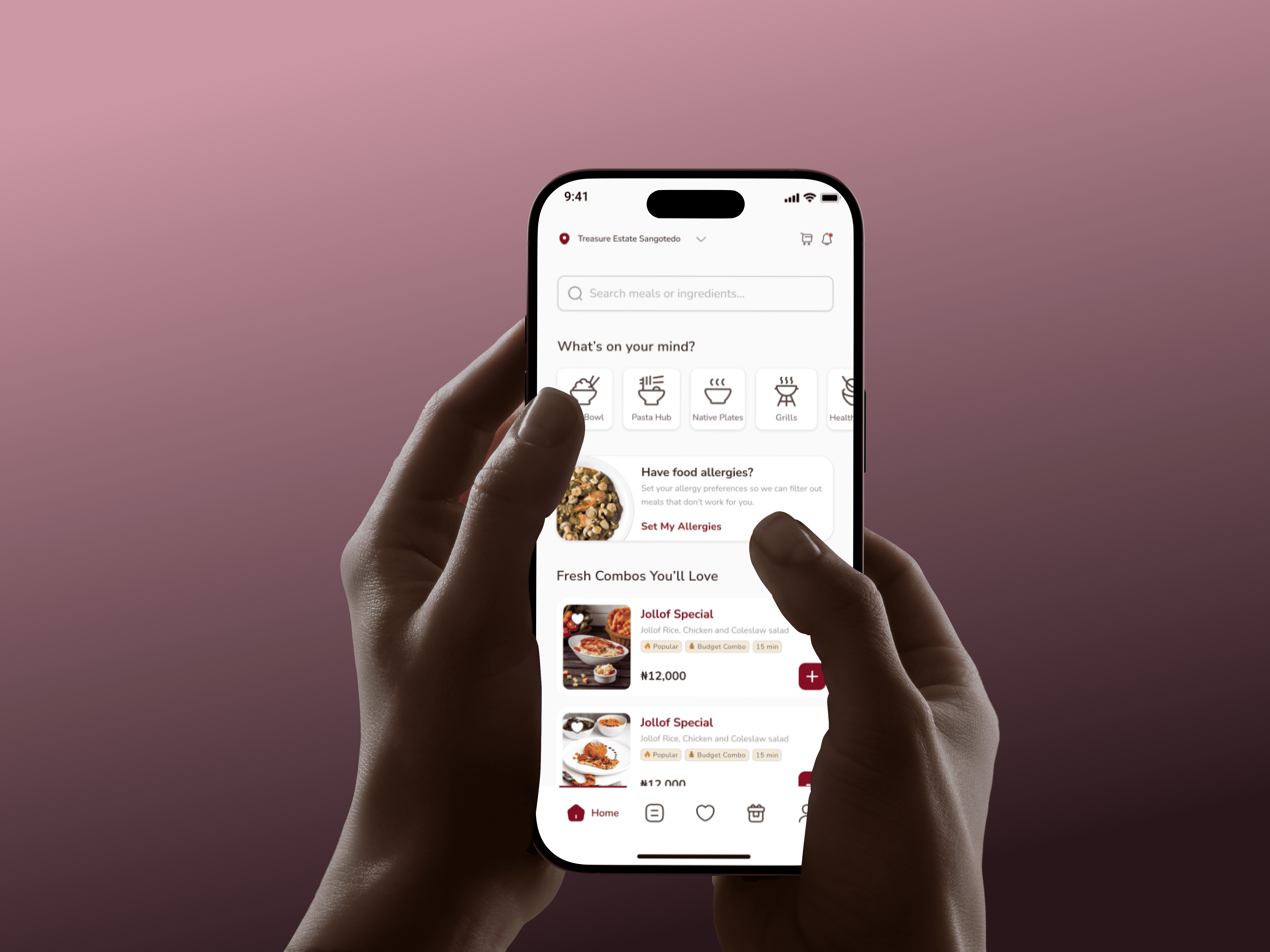
1. Preference-Driven Onboarding
Instead of generic sign-up flows, we introduced a guided preference system:
Taste profile
Allergies
Dietary goals
Decision:
Keep inputs simple and progressive to avoid drop-off.
2. Beneficiary System
Users can order for others (family members, children, etc.)
Why it matters:
Expands use cases beyond individual ordering
Enables family and institutional scenarios
3. Simplified Discovery
Rather than overwhelming users with full menus:
Meals are filtered and prioritized
Recommendations are context-aware
Goal: Reduce cognitive load and speed up decisions.
4. Feedback & System Clarity
We designed clear system responses:
Toasts (e.g., item added to cart)
Success states (e.g., preference completion)
Transactional emails
This ensured users always knew:
What just happened? What should I do next?
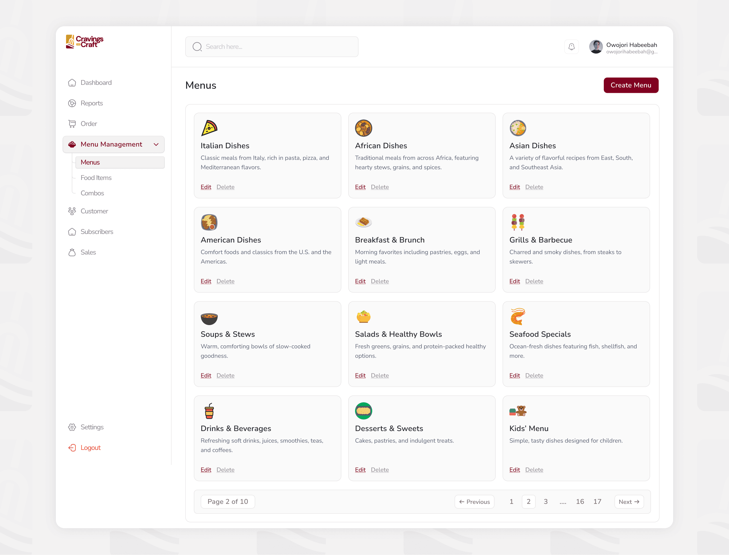
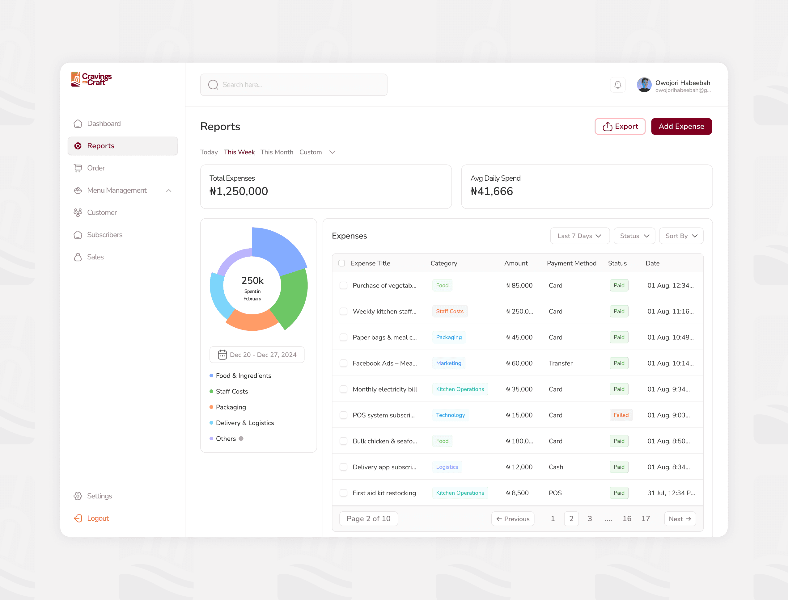
5. Admin Dashboard Design
The dashboard was designed for operational clarity, not visual complexity.
Key considerations:
Clear data hierarchy
Simple workflows
Scalable structure for future features
6. Consistent Design Language
Across app, dashboard, emails, and website:
Unified color system (burgundy & gold)
Consistent typography and spacing
Predictable interaction patterns
This helped create a cohesive product ecosystem, not disconnected interfaces.
Key Trade-offs & Why We Made Them
A significant part of the process involved intentional compromises.
1. Personalization vs Speed
Trade-off:
Advanced personalization engine vs rule-based filtering
Decision:
Start with simple logic to enable faster delivery
2. Feature Depth vs Usability
Trade-off:
Highly customizable flows vs streamlined UX
Decision:
Prioritize simplicity to reduce friction and drop-off
3. Admin Complexity vs Efficiency
Trade-off:
Comprehensive dashboard vs lightweight MVP
Decision:
Focus on essential workflows first
4. Design Perfection vs Delivery Timeline
Trade-off:
Polished visuals vs shipping on time
Decision:
Prioritize functional clarity over visual perfection in early stages
Collaboration with Engineering
I worked closely with the engineering team throughout the project.
Key Responsibilities
Translating product ideas into clear, buildable designs
Aligning on technical feasibility
Making real-time adjustments during development
Approach
Shared context early, not just final designs
Discussed trade-offs openly
Adjusted flows based on technical constraints
Example
In some flows, we simplified interactions due to backend limitations.
Rather than forcing complex solutions, we redesigned experiences to fit the system while maintaining clarity.
This collaboration ensured that:
Design decisions were not isolated — they were grounded in reality.
Website & Framer Development Process
I independently designed and developed the marketing website using Framer.
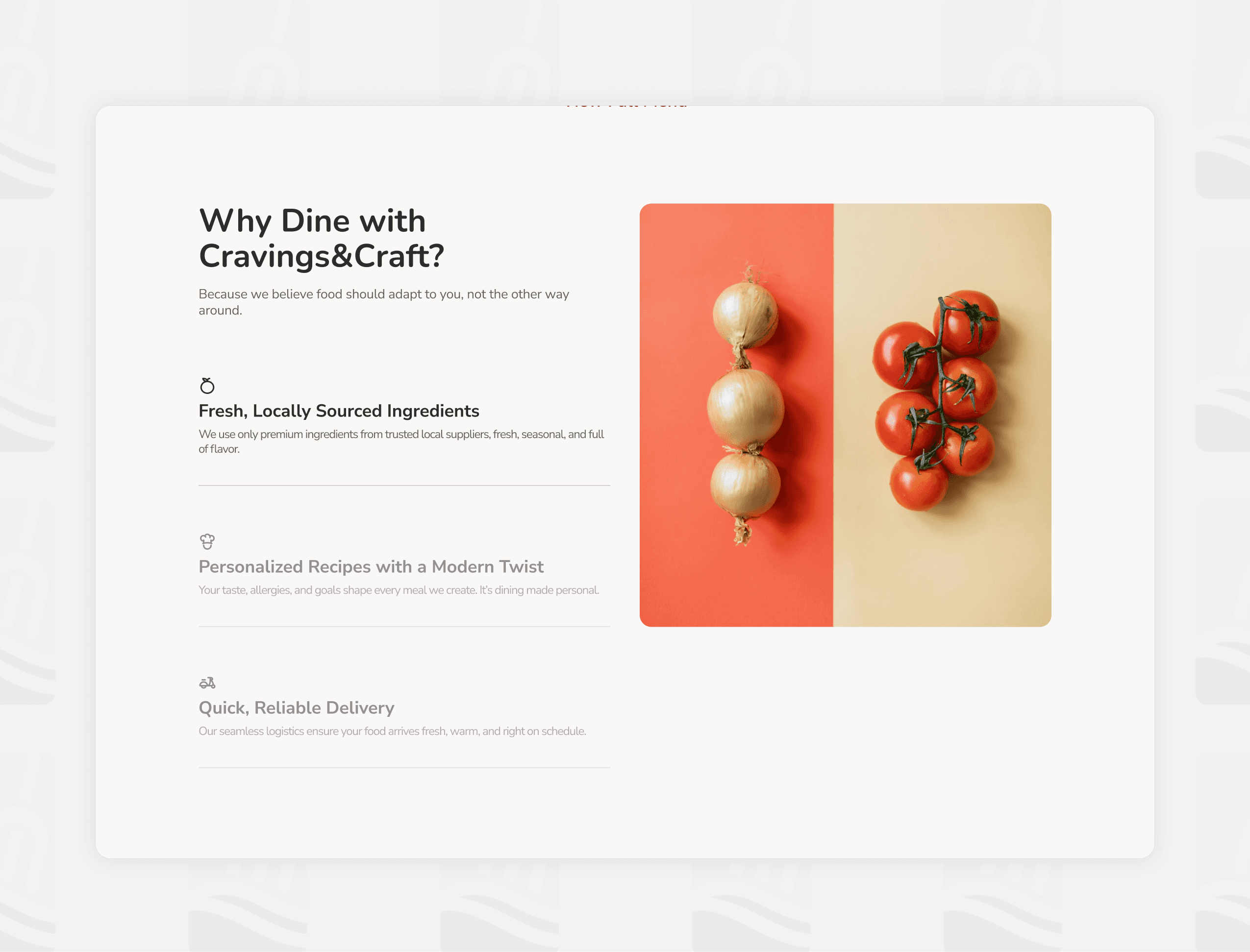
Goals
Communicate the product clearly
Position the brand as modern and premium
Support onboarding and partnerships
Approach
Structured content for clarity and flow
Focused on informational storytelling, not aggressive conversion
Built responsive layouts directly in Framer
Impact
Reduced dependency on engineering
Enabled faster iteration
Maintained design consistency across product and marketing
2

Outcome
While still evolving, the design approach enabled:
1. Clear User Flows
Users can move from onboarding to ordering with minimal friction.
2. Reduced Cognitive Load
Simplified interfaces improved usability and decision-making.
3. Scalable Foundation
The system supports future expansion into:
Subscriptions
Institutional partnerships
Advanced personalization
4. Consistent Brand Experience
Across app, dashboard, emails, and website.
What I Learned as a Product Designer
This project reinforced that product design is not about creating perfect screens — it is about making informed decisions under constraints.
Key Takeaways
Clarity beats complexity
Simple, well-structured experiences outperform feature-heavy designs.Constraints drive better decisions
Limitations helped prioritize what truly matters.Collaboration is critical
Good design happens through alignment with engineering and business.Consistency builds trust
A unified system creates a more reliable experience.MVP is about learning, not completeness
Shipping the right core experience matters more than building everything.
Closing Reflection
Designing Cravings & Craft required balancing:
User needs
Business goals
Technical realities
As the sole designer, I was responsible for ensuring that every decision contributed to a coherent, scalable product system.
The result is not just a collection of interfaces, but a foundation for a personalized food platform that can grow over time.
3

Recent Designs


